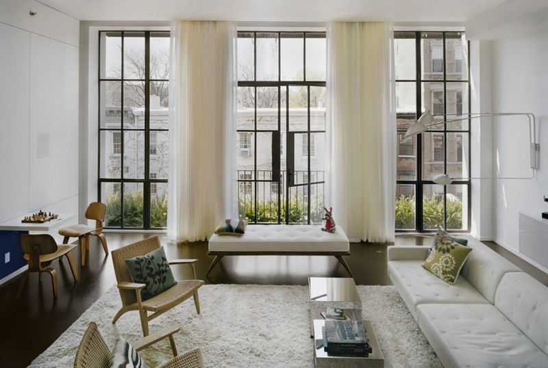
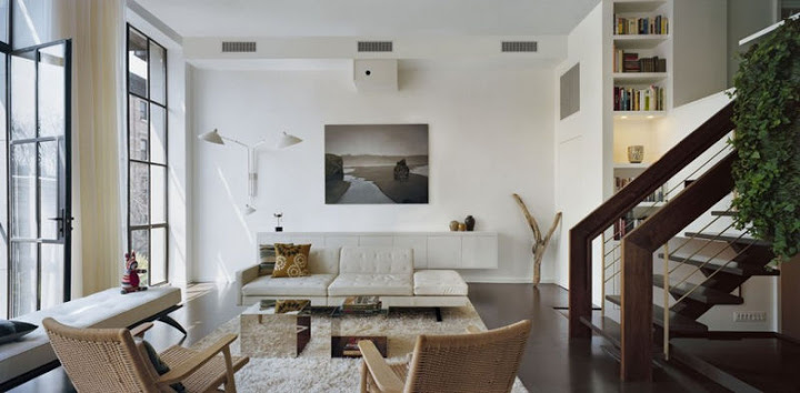
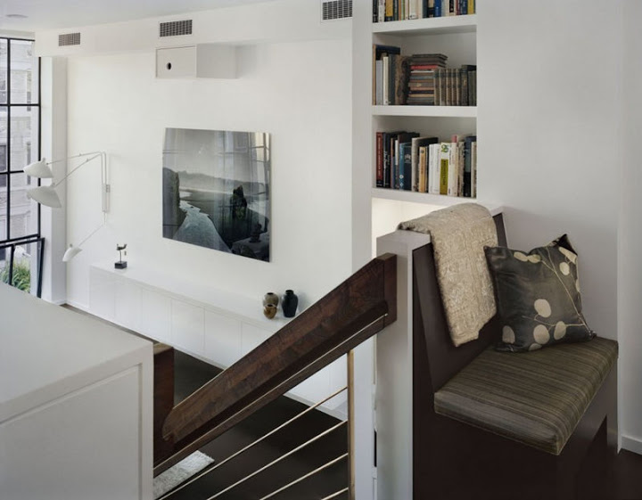
The owners of this duplex apartment, located on a beautiful tree lined street in the East Village, retained Pulltab Design to create a unique living environment for a young family of four. As a starting point, the clients requested that their 2,400 square foot apartment be selectively renovated and that the new design revolve around not only creative architectural additions but also the thoughtful selection of free standing furniture and lighting. In the schematic design phase, initial conversations revolved around modern masters such as Geoffrey Bawa, Carlo Scarpa and Richard Neutra. Based on these conversations, it became apparent that the new design should strive to create a warm and open living environment with unique handcrafted detailing.
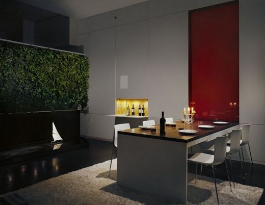
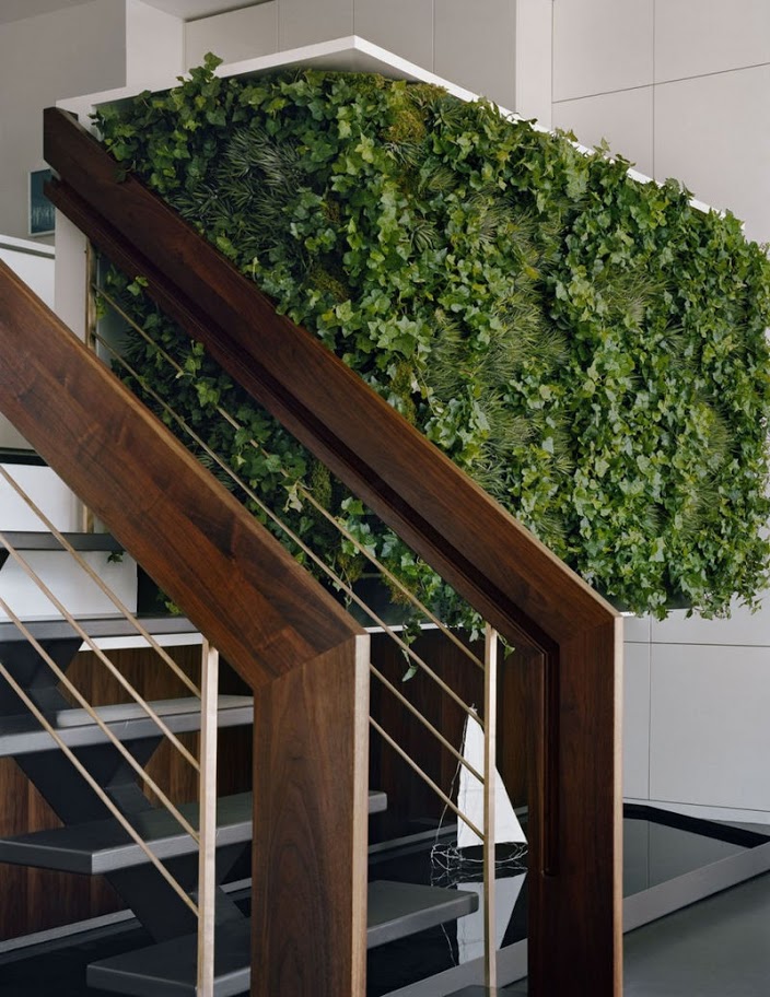
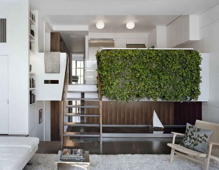
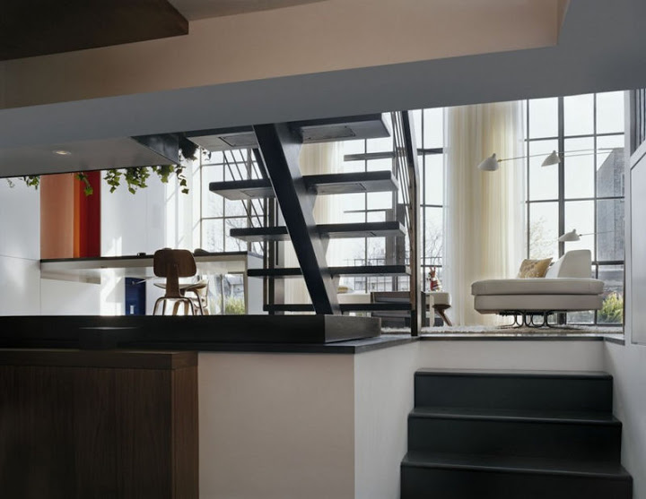
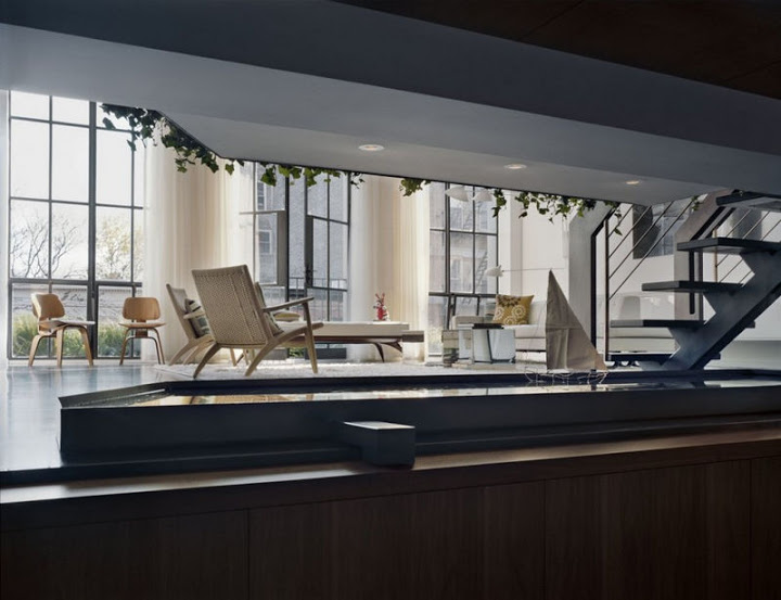
Materials such as stained concrete, American black walnut, bronze and steel were selected along with modernist finishes, including hand applied active patinas, true pigment paints and high gloss lacquer surfaces. The heart of the apartment centers around the living/dining areas. As part of the architectural construction, a new cantilevered dining ‘pod’, extending from the 5th floor slab, was added to increase the size of the kitchen. On the outside surface. of this pod, a custom planted garden wall was installed with the intent of creating a focal point, with a slightly mysterious quality, for the living room. In combination with the vertically planted wall above, a shallow reflecting pool, custom fabricated from folded steel sheets, was placed in the living room. This reflecting pool functions both as a means to capture water droplets, from the vertical garden wall’s concealed irrigation system, and also allows for the addition of a calming indoor water garden, stocked complete with colorful goldfish.
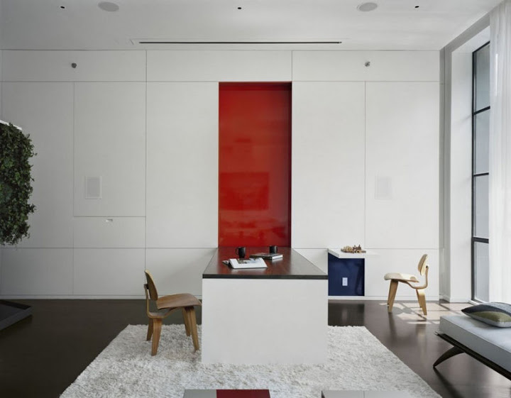
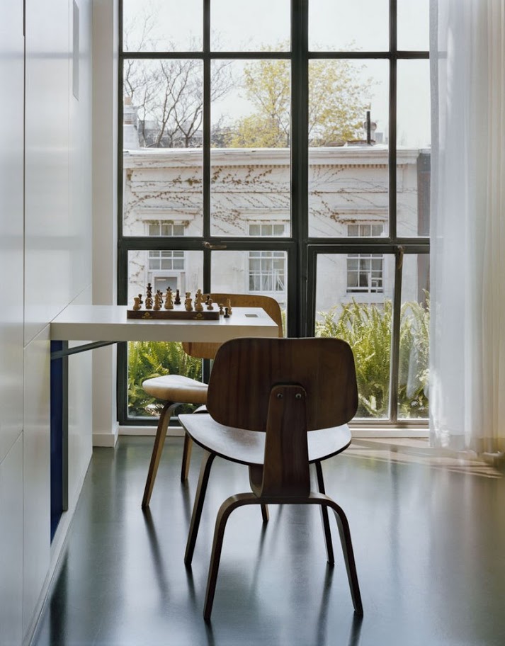
On the east wall, a new double height panel system was installed, assembled from painted furniture grade plywood. The panels, both fixed and functioning, are separated by a pattern of reveals which add both texture, interest and most importantly a sense of scale, to what was originally an overwhelming surface. Several of the individual panels, denoted by custom routed hand pulls, open to reveal (from right to left) a chess table, a large 8′ long claro walnut dining table and a fold down illuminated bar with glass shelving. To delineate the function of each panel, three colors were chosen: a bright orange, a glowing yellow (for the concealed bar) and a deep blue. These colors add an active layer to the space while tracing their connection back to Piet Mondrian’s inspirational composition paintings, from the 1920′s and 30′s.
