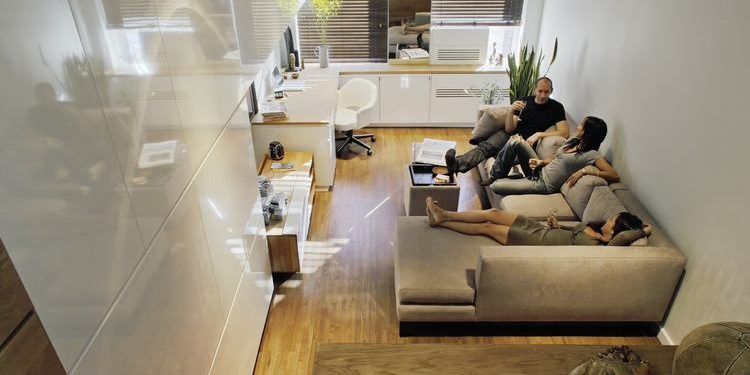
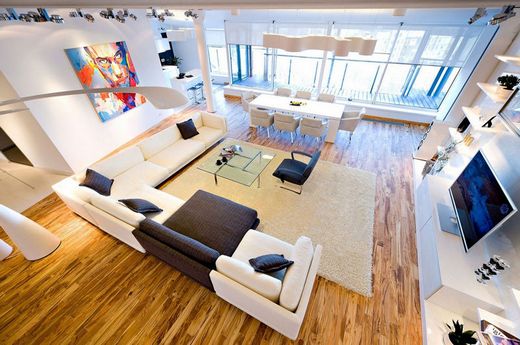
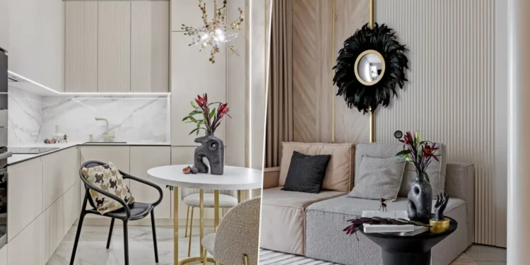
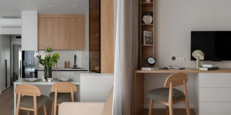
French architect Maurice Padovani has redesigned the interior of this home located by the beaches of the Prado in Marseilles, France.
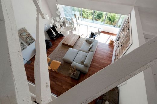
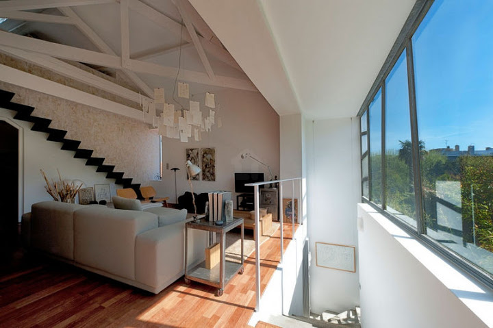
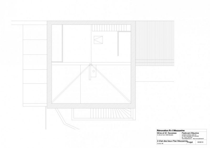
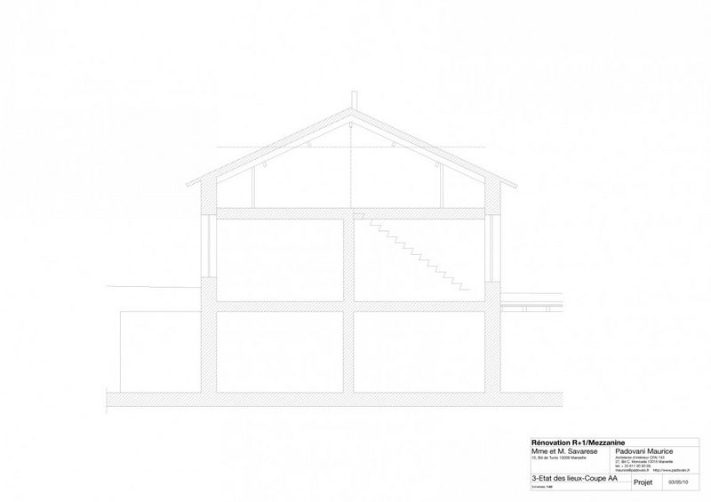
“Located by the beaches of the Prado in Marseilles, this former smallholding flanked by a stable was renovated in three steps. At the very end of the nineties, the young family setting up on the first floor gladly agreed to the two children sharing the same room for a time. The volume is then entirely freed from all its partitions and false-ceilings thus revealing a rich and space-structuring framework. Behind the complexity of the assemblings of beams and joists, the parents’ bedroom slips in; open to the living room and accessible by a metal stairway. The main wall’s top is entirely open and the old staircase, formerly external, is integrated to the house’s volume thanks to the installation of galvanised steel bays which oblique uprights give rhythm to the surface.
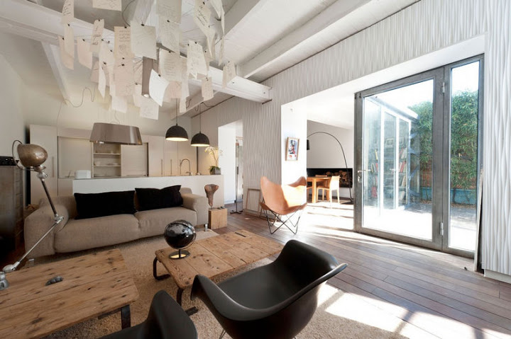
A few years later, the couple acquires the house’s semi basement as well as an adjoining outbuilding. This time again, the main walls are wide open in order to ease the passage of light and new steel bays, as an echo to the first installation, substitute themselves to masonry. The “cooking”, “meal” and “living room” functions can there from move down to the entire ground floor. And there again, to guarantee the freest flow between the spaces, every partition is removed. The little garden’s terrace, layed out during the same building campaign is covered with large ipé blades and the same wood, on the same level, is used for the entire semi basement in order to insure a continuance in reading and feelings. The big wall standing between the house and the now linked outbuilding is covered with a gouged mdf wainscot because of a recurring moisture that is impossible to resorb. The installation of this panel slightly apart from the wall creates an air flow that suppresses the effects of humidity. The panel surface’s undulating relief makes it vibrate under the light.
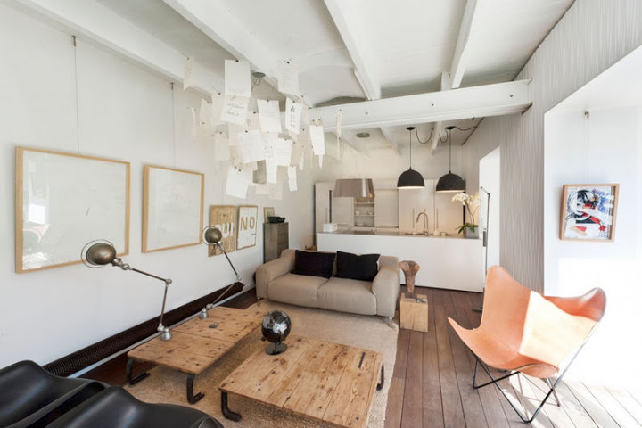
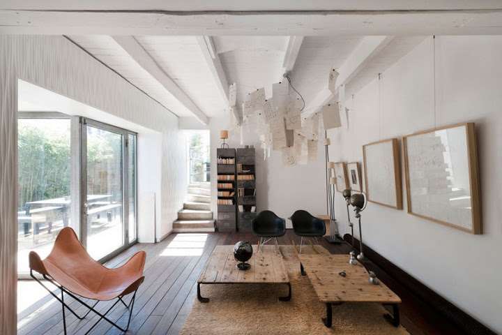
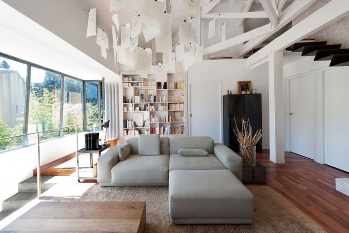
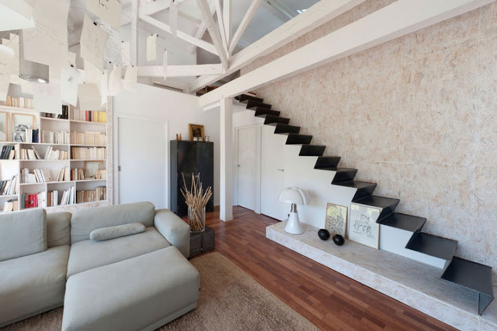
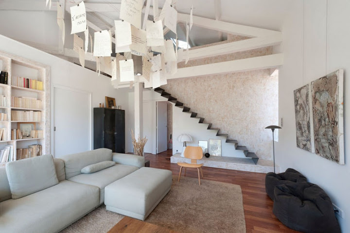
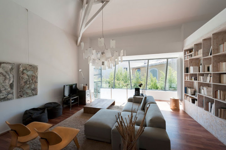
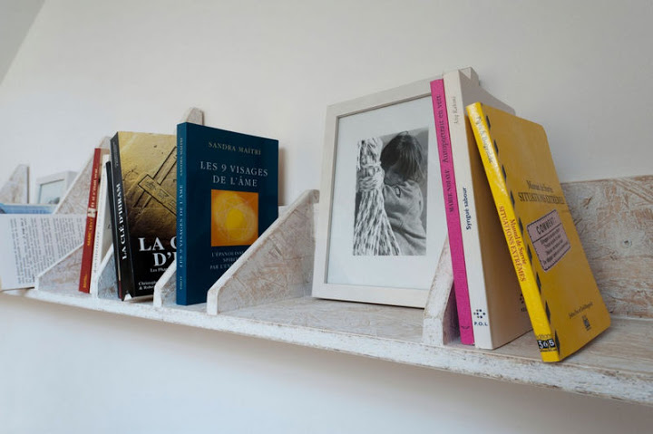
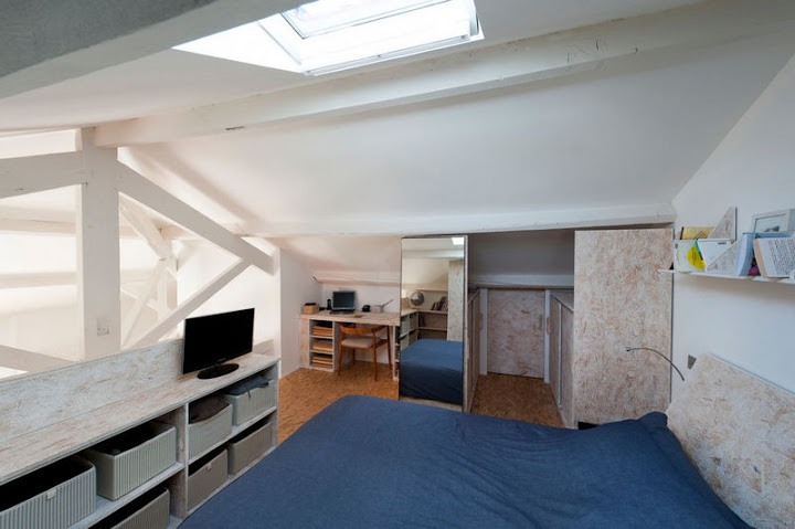
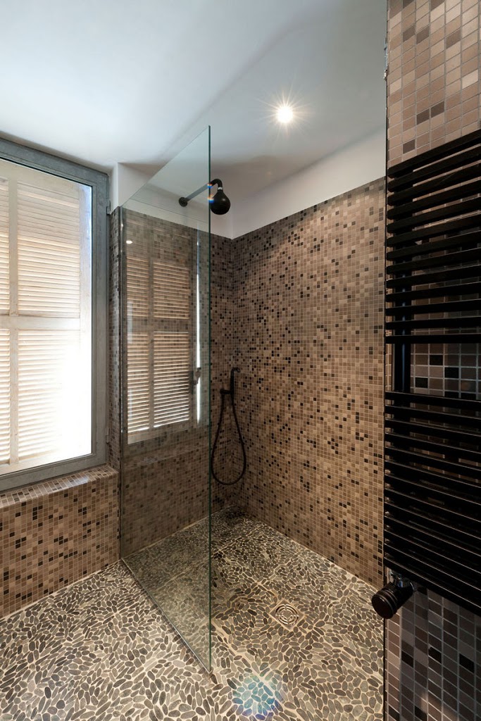
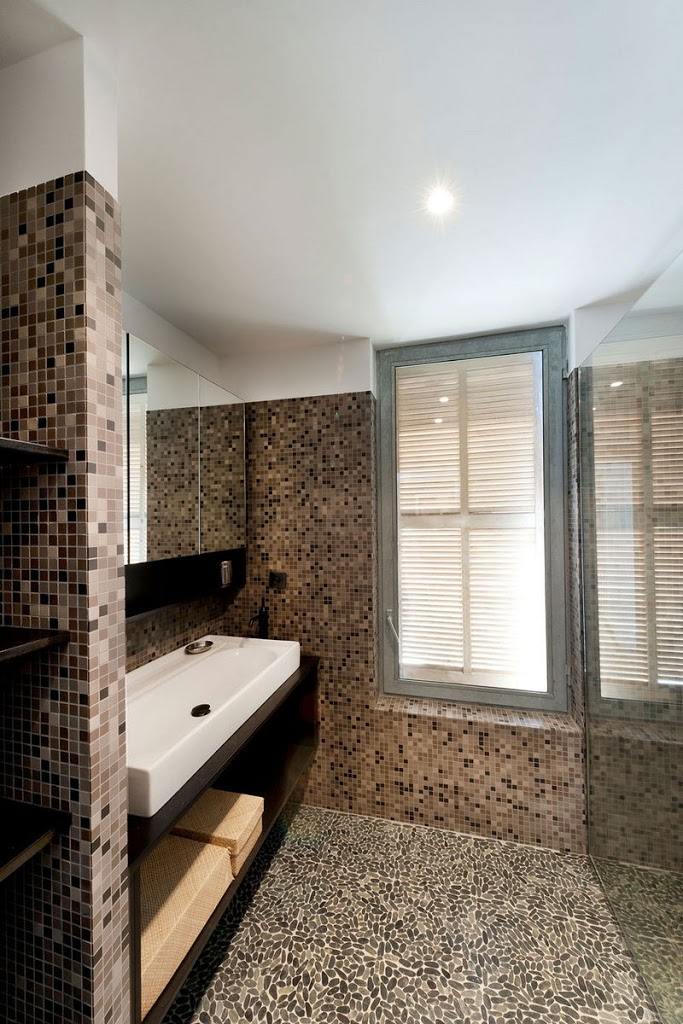
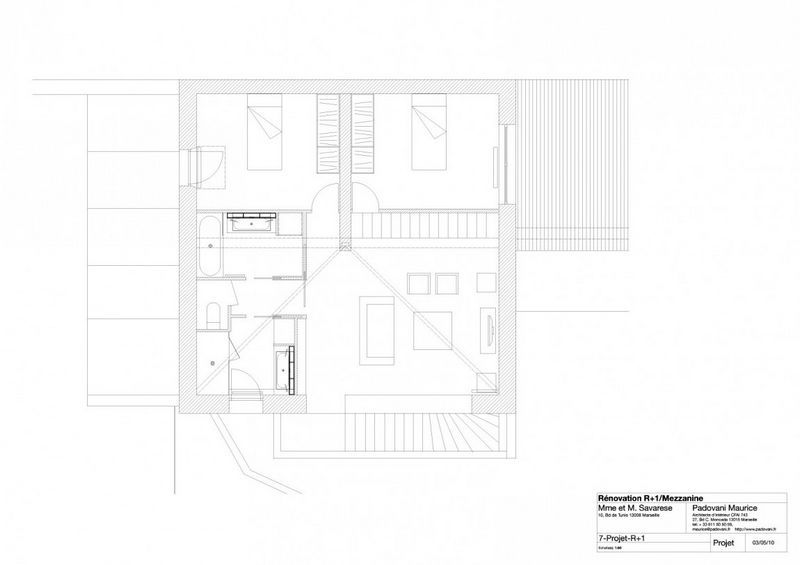
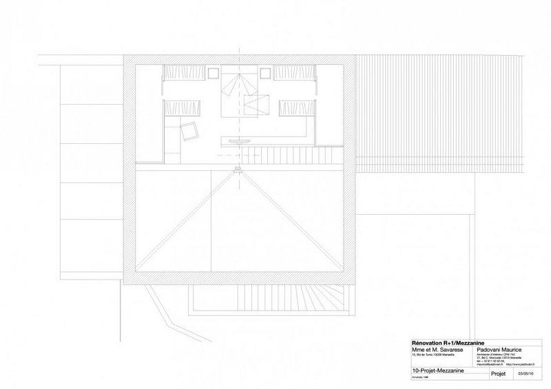
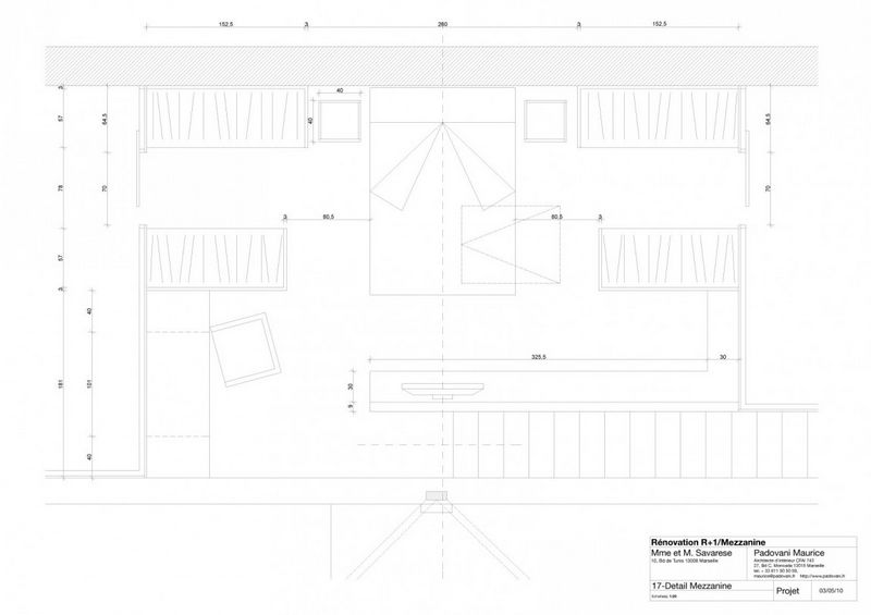
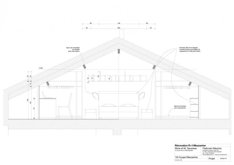
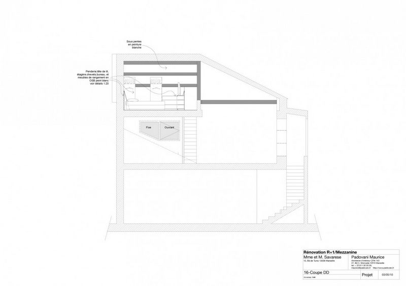
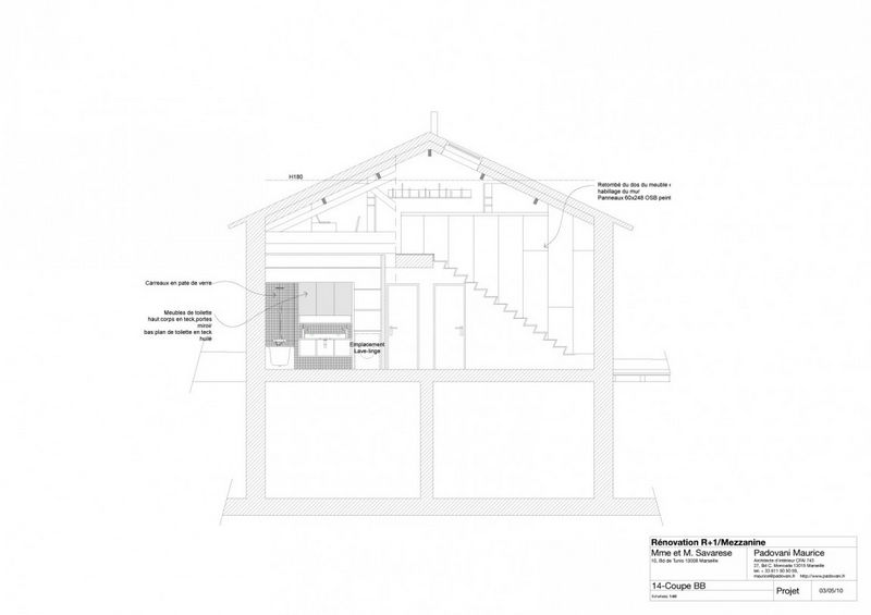
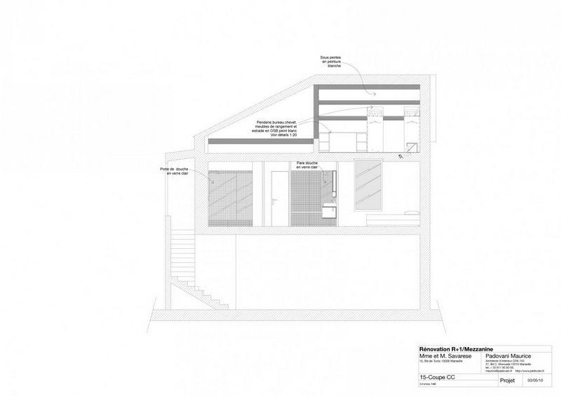
The two children became teenagers, the first floor wad recently and once more completely restructured. The kitchen space, turned into a small bedroom before is now dedicated to two new bathrooms, the chimney is gone and a new room was created under the mezzanine allowing at last the boy and the girl to be comfortably and fairly installed. The stairway leading to the mezzanine, a bare folded steel sheet, icon of the house, was moved onto the new room’s partition and firmly fixed to a structure hidden within the wall. As with the semi basement, a wainscot, above the steel stairs, covers a wall that converts into a lifeline behind the overhead framework. The OSB used for the wainscot, whitened and sanded as for a modest “céruse” (a particular bleaching technique), is used as well for the building of the living room’s bookcase, the wardrobes in the children’s rooms and for all the furniture in the parents’ bedroom. The kitchen is composed of two fully white-lacquered parallel blocks. Both are apart from the walls around them as well in order to give them a status of independent pieces of furniture and not the one of an integrated system. The block in the back, taller and longer, is essentially devoted to the storing of implements, dishes and supplies. The low islet serves as a functional bar for the dish washing, the preparation and the cooking.
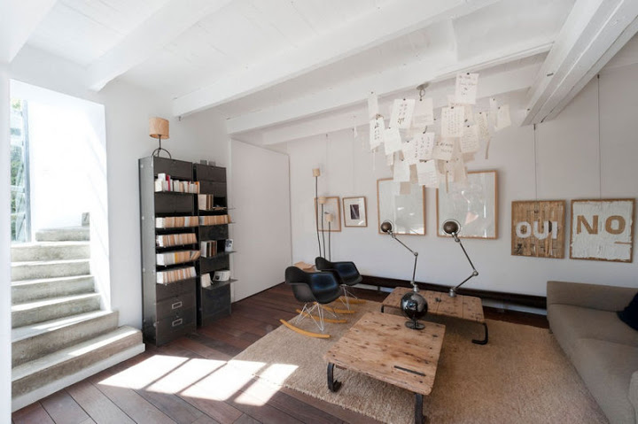
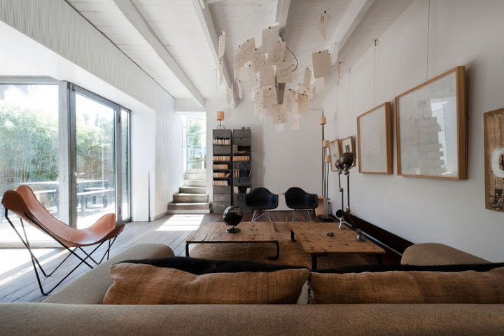
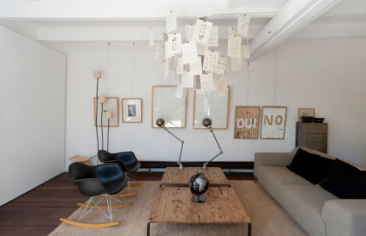
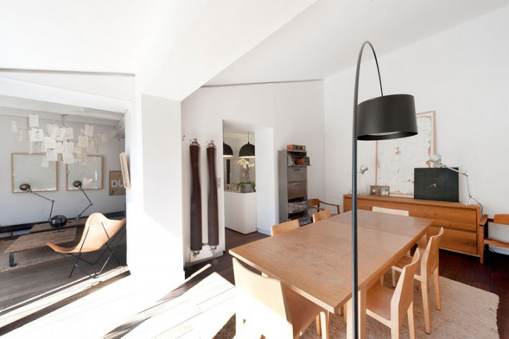
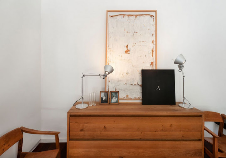
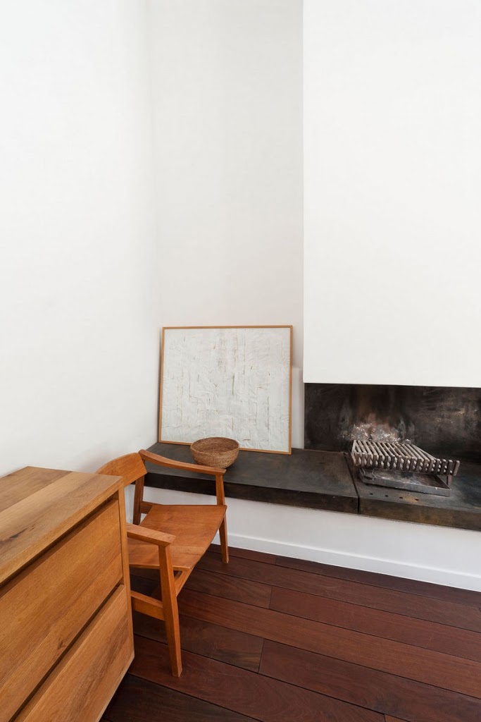
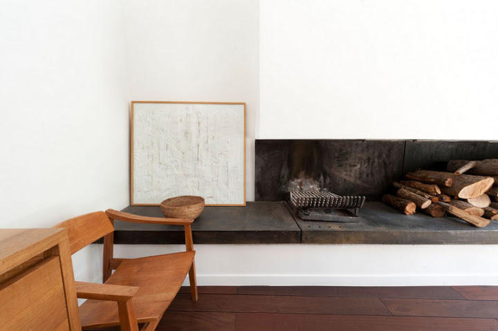
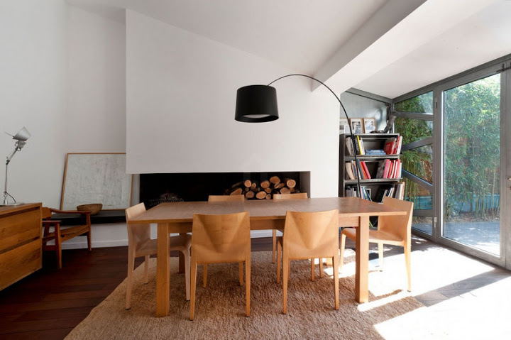
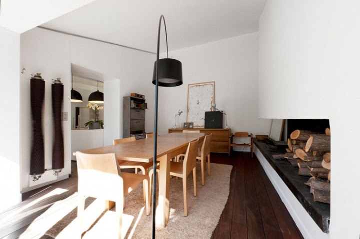
The islet’s worktop is a simple zinc sheet framed in an aluminium angle bracket which slight gap with the piece’s body accentuates the suspension effect. Two suspended Diesel’s Rock lamps (Foscarini) light the top. At the other end of the islet, the Elica Twin stainless hood complements the device. To serve the extending oak table, the chairs “la Leggera” by Ricardo Blummer (Alias). The table is enlightened by the short version of Twiggy, the contemporary alternative to Achille Castiglioni’s classic Arco. The hearth is made of three grey cast-iron sheets, moulded for the occasion. Around the antique freit pallets reconverted into living room coffee tables, a Greg couch by Zanotta and two RAR by Eames for Vitra come with another design icon of the fifties in a prestigious leather-and-steel version : Airborne’s AA. This space in the continuity of the kitchen can be used as a space to have a meal as well. To provide for this contingency, An Ingo Maurer Zettel’z was set up to light the scene. Two meticulously restored and perfectly moving workshop lamps complete the lighting device. On the first floor, another Zettel’z lights the living room space for it was, at the origins of the project, the meal-taking spot. The table migrated, the chandelier and its paper keepsakes stayed.
